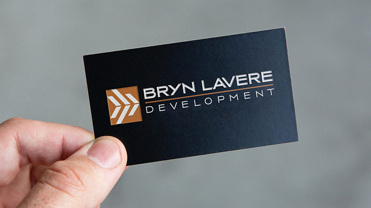
Campbell Associates engaged Stacey and Associates to develop a new logo for their sister company: Bryn Lavere Development. The challenge was that Campbell Associates was also due for a brand refresh. The goal was for both company logos to have complementary colors and styles, therefore both logos were developed simultaneously even though they would be rolled out at different times. Company leaders wanted a very clean look that would also be ‘hip and classy, not too traditional.’ After several rounds of revisions, we landed on a linear symbol that evokes the idea of forward motion within the solidity of a structure. The icon can be used alone for digital applications, while the full logo translates well for many formats including large-printed banners or embroidery on apparel.

